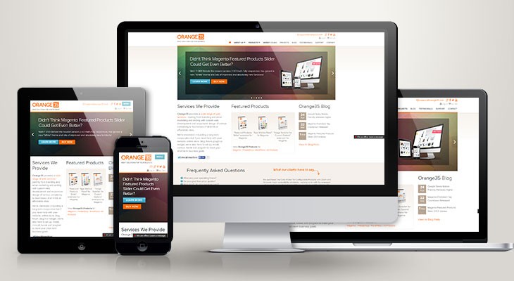
What is Responsive Web Design (RWD)?
Responsive Web Design is a modern design and development technique aimed to make the website viewing experience on any device like computer, tablet and smartphone optimal and user-friendly. Because a variety of devices has now become a big part of our everyday life, it’s not hard to figure out why having Responsive Design as a part of your website is recommended if not necessary.
The way it is achieved is that all the website elements, i.e. navigation, links, images and text are reorganized based on the size of the device the website is viewed on. It takes into account not only screen resolution, but also orientation, so the arrangement of the site elements on the portrait and landscape orientations of the tablet for example may be different as well.
Using a simple language, it’s actually easy to learn if your website is responsive or not. You can manually resize the browser window when you’re at your desktop and see what happens with the website elements. If a website content is readjusted “responding” to the size of the browser window – it’s a clear sign of a responsive website! At the same time, websites that remain static regardless of the browser window size, it’s not responsive.
How does it work?
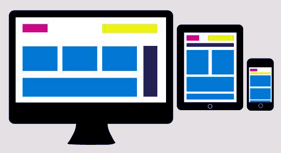 It takes the elements of your website (text, images, navigation) and instead of making it fixed it makes them proportion based having the website re-orginize based on the size of the device into a 4-column layout on the desktop, a 3-column layout on the laptop, 2-column on the tablet and finally 1-column on the smartphone.
So you may not realize it but it’s basically one website with four layouts. Then within each of those column-based layouts, the website blocks are re-arranged differently also.
Is it hard to implement?
It’s not hard to do if it’s envisioned from the very beginning when the site is being developed, it is of course harder to implement after the site is built, but still it all depends on the complexity of your website as is. Sometimes, going with Responsive Design may not be a good idea at all, this is when the website is highly interactive, heavy design-wise with all kinds of animation effects, etc., in cases like this, it’s probably better to set a separate mobile site version.
It’s absolutely necessary that the site viewing is optimal so that users can see everything, easily navigate through and get the information they’ve actually come to the website for, but in the end it’s up to you whether to go with Responsive Design option, like many of our customers did.
The websites we develop from scratch already come with responsive design technique built in, so as a big argument to those referring to Responsive Design as a more expensive option, if you build a new website with us you practically don’t pay any extra for RWD at all.
Contact us for a free price quote on the website development!